1) 1992/93 away: A truly sensational, absolute migraine of a kit from Matchwinner who really outdid themselves home and away from Dene Court this campaign. A repulsive purple and turquoise number that should really come with a public health warning. Courtesy Football Kit Archive
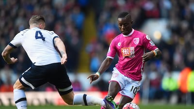
BOURNEMOUTH BEST: 5) 2015/16 third: Fair play to Bournemouth, here, as they marked their first season in the Premier League - and first ever in the English top-flight - in some style. There’s just not enough pink kits out there in the football world to celebrate, so this classy number needs to be enjoyed. And, most importantly, sales of every kit raised money for the Breast Cancer Care charity, so well done all round! Getty
4) 1990/92 home: Echoes of Franco Baresi and Paolo Maldini in their AC Milan pomp here as early '90s Bournemouth go all Rossoneri in the third tier of English football, right down to the white shorts and socks. A quality piece of kit that makes it even more baffling what direction they would go for next (see worst kits). Courtesy Football Kit Archive
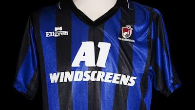
3) 1990/92 away: From the Rossoneri at Dene Court to the Nerazzurri on their travels from the south coast. They may have just been relegated from the old Division Two but Bournemouth, and kit manufacturers Ellgren, did themselves proud here as this Inter Milan-inspired effort has a retro feel that would not look out of place today. Courtesy Football Kit Archive
2) 2016/17 away: A lovely all-blue effort here with horizontal tonal stripes across the body, finished off with white trim. A really good effort from JD Sports this, as Eddie Howe’s team enjoyed their second season in the top flight. Getty
1) 2014/15 away: From the stripes of Italian football aristocracy to Spain’s mighty Los Blancos - Bournemouth don’t mess around when it comes paying homage to Europe’s top clubs. Head-to-toe in white with a nice bit of gold trim that would not have looked out of place donned by David Beckham, Zinedine Zidane and the rest of Real’s Galacticos. Getty
WORST: 5) 2008/10 home: A real boring all-red effort and one of the final strips before the sensible decision to readopt the club’s favoured black and red stripes. Reuters
4) 2000/01 home: a weird looking kit which looks like the black stripes have fallen off the arms after some kind of washing-machine blunder. A frustrating season all-round as the club finished just outside the third-tier play-offs, despite 18 goals from on-loan striker Jermain Defoe. Getty
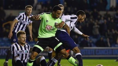
3) 2016/17 third: How many times must this be said? Neon yellow tops are acceptable attire for cyclists and joggers going about their business at night to stop them getting run over but have no place on the football pitch. A blight on an otherwise positive season for the club. Getty
2) 1992/93 home: A humdinger of a battle between a pair of classic abominations - and both from the same season! It was a miserable time for the Cherries, languishing near to the foot of the old third-tier and having to appear shame faced onto the pitch in these kits. The fact this red with white arrows eyesore was denied top spot tells you how bad the away one was. Courtesy Football Kit Archive
1) 1992/93 away: A truly sensational, absolute migraine of a kit from Matchwinner who really outdid themselves home and away from Dene Court this campaign. A repulsive purple and turquoise number that should really come with a public health warning. Courtesy Football Kit Archive