The ODI World Cup starts in Ahmedabad with a clash between defending champions England and the last edition's losing finalists New Zealand.
After much uncertainty, delays and rained-off warm-up matches, the action begins at the biggest cricket venue in the world – the 132,000-capacity Narendra Modi Stadium.
Over the next month and a half 10 teams will look to win the top prize in 50-over cricket. And they will do so in their traditional colours, which form part of the kits.
Here we take a look at the World Cup 2023 kits and rate them from most liked to least.
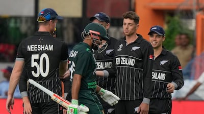
New Zealand

The best jersey of the 2023 World Cup. Simple, striking and a design pattern that pays homage to arguably the finest collective bunch of World Cup kits – the 1996 edition.
You can almost never go wrong with black and the Kiwis have got the perfect amount of accents to make the kit pop. A collector’s item.
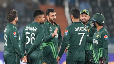
Pakistan

A classic kit with a nod to arguably Pakistan’s finest World Cup attire – 1999. The star from the national flag is placed prominently and artistically across the torso, which also helps set it apart from the other dark green outfits in the tournament.
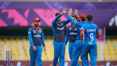
Afghanistan

The most eye-catching kit of the tournament. Afghanistan have gone heavy with the design elements and the result is a visual delight. The pattern on the jersey is quite mesmerising, even though some might feel there is a bit too much going on there. But full marks for concept.
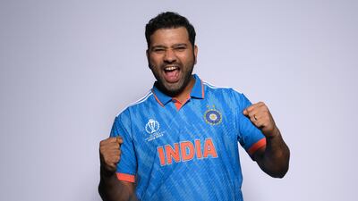
India

The home team’s light blue kit looks fresh. The shoulder design, a signature style of sponsors adidas, gives prominence to the national flag colours.
India's recent World Cup kits did not have the country's colours prominently on it but they have done so this time, just like in 2003, 2007 and 2011.
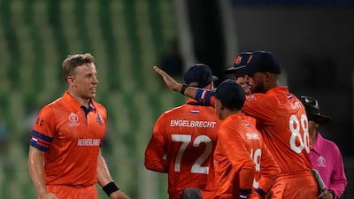
Netherlands

The second most distinctive colour of this World Cup. Orange is synonymous with the Dutch and they have continued that tradition, while adding a striking blue motif on the sleeve.
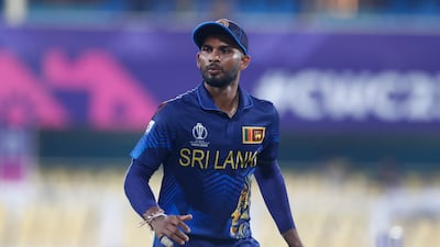
Sri Lanka

A magnificent lion design adds character to the overall look. However, the design element gets lost on the side of the jersey. Could have done more with that great template.
South Africa

Looks like another dark green kit but the Proteas have smartly integrated their national flag design across the shoulders of the jersey, providing visual relief in an otherwise simple kit.
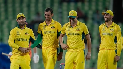
Australia

The Aussies have done hardly anything with their kit. Just dipped their playing attire in canary yellow – which is undoubtedly the most recognisable and awe-inspiring colour in cricket.
A few prominent star symbols on the jersey would have made it memorable.
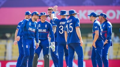
England

A very basic design for the defending champions with minimalistic patterns on a dark blue kit. Their 2019 kit was absolutely brilliant. Should have stuck to those shades.
Bangladesh

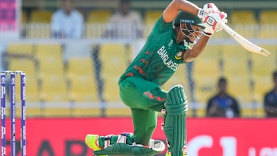
Nothing to write home about. At quick glance, you might struggle to differentiate between the Bangladesh and South Africa kits. The Tigers have kept the red stripes to a minimum.
