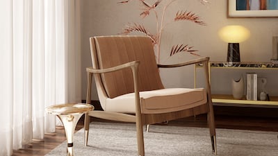
The Pantone Institute, widely considered the authority on all things colour, has selected Mocha Mousse as its colour of the year 2025.
The “evocative soft brown” captures people's increasing desire for harmony and balance, according to the colour institute. The earthy shade also “nurtures with its suggestion of the delectable quality of cacao, chocolate and coffee, appealing to our desire for comfort”.
Laurie Pressman, vice president of the Pantone Colour Institute, says Mocha Mousse is a logical progression of last year's colour of the year, Peach Fuzz, with similar themes of leaning towards all things soft and neutral. “This is a colour that's honest. It's authentic. It's a colour we see in nature. We know it's real,” said Pressman.
Sarah Merchant, founder and design director of Creative Nutshell Designs, says: “In the midst of glamorous, even ostentatious tones, modest brown has found its year of fame. From coffee to chocolate, this is the colour that blends in harmoniously, yet stands out as rich, stable and warm."
Dos and don’ts when using Mocha Mousse at home
Merchant shared the following home decor tips with The National. “The quiet luxury of this tone allows for it to be used as a calming factor. Use it as a solid base tone – either as understated upholstery in distressed leather, or as a muted tapestry – and balance it with a pastel palette, complement it with neutral colours or amp it up by accenting with golds, copper or bronze," she says.
“Think of this muted brown as the new grey. The roasted natural hue can be used as a relaxing grounding element to offer a sophisticated yet cozy ambience. Psychology suggests that browns are comforting because they are linked with personal stories and experiences. It is not as extreme as black, yet rich enough to stand out on its own. Flooring options in brown will rule the interior palette as the most preferred choices of the year.
“For a fresh crisp look, pair Mocha Mousse with whites and clean-lined geometry. For a pop of colour and zing, add tinges of orange. For a natural earthy feel, pair it with deep blues, mauve or off-whites. Royal purple, shades of emerald or even a deep mustard will offset this shade well."
As for when and where not to overdo Mocha Mousse, she explains: “Lighting is important to highlight the right tonality of this mocha brown. Methodically stay away from white lights – only warm lighting is advisable if you do not want this brown hue staring back at you like a wet lump of plaster. Also, avoid pairing mocha with happy reds, neons or any sharp, overly perky tones such as sunshine yellow, bright pinks or turquoise blues.
“Browns in the past have worked well with heavy fabrics such as velvet and suede. However, this year go easy on the density and gathers. Add a more natural twist by accenting the heavier materials with breathable fabrics to avoid adding too much unnecessary maintenance and drama.”
Past tones
Colours speak a fascinating language and their impact extends beyond fashion runways and furniture catalogues to the collective mood in society, according to the experts at Pantone.
Peach Fuzz, for example, is a warm, enveloping shade of apricot, and was chosen by the colour institute in 2024 for its ability to “stir feelings of tenderness, peace and compassion, echo our innate yearning for closeness and connection, and aim to soothe a troubled world”.
The shade for 2023 was Viva Magenta, meant to be “a new signal of strength that merges the warmth of a natural world with the endless rich possibilities of the digital space”. The purplish red is similar to the gradient colours used in Instagram’s camera app icon, and to the shades on the musical note logo of TikTok, the world's most popular video-sharing platform.
In 2022, the institute selected Very Peri, “the happiest and warmest of the blues” blended with dynamic violet-red. It was meant to represent a blend of trustworthiness, tranquillity and comfort (from the blue) and energy, joy and creativity (from the violet-red) as the world recovered from the isolation of the Covid-19 pandemic.
In 2021, Pantone chose two shades: Ultimate Grey and Illuminating yellow. The solid grey represented thoughtfulness, composure and resilience, while the cheery yellow brought optimism, energy and hope of overcoming the uncertainty of the novel coronavirus. Other past shades include Classic Blue in 2020; and Living Coral in 2019.
Colouring the future

Pantone’s colour of the year is based on its analysis of pop culture, fashion trends, sporting events, popular travel spots, social media, the entertainment industry and the latest technologies.
Already, tones of mocha have shown up on the 2025 runways of Hermes and Valentino.
The institute’s choice also typically acts as a cue for fashion, interior and industrial designers to adopt the colour into their future collections and concepts. Up for sipping mocha in mocha, anyone?


