The reborn Nokia 3310 was the star of this February's Mobile World Congress, winning the hearts of those old enough to feel pangs of nostalgia for the original's classic "candy bar" design, seemingly inexhaustible battery, and Snake, the early mobile game that put millions of thumbs out of joint.
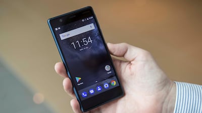
Alongside the crowd-pleasing 3310 however, Nokia’s new brand owner HMD Global also unveiled the Nokia 3, a brave attempt to re-enter the furiously competitive low-priced smartphone market armed with little more than a throwback design and a pared-back Android experience.
It is a challenge for any handset retailing at Dh499, the starting price for the Nokia 3, to distinguish itself from dozens of other smartphones at that price point. Specs-wise there is nothing on the handset that particularly stands out from the crowd: the 5-inch HD display gives the same solid video performance as its peers.
The Nokia 3’s 8MP rear and front cameras are similarly in line with the crowd, offering decent basic imaging capabilities. It has enough power under the hood for basic everyday apps such as Twitter and Facebook but, like its peers, will struggle with more intensive gaming apps.
Its 2630 mAH battery meanwhile is more or less in line with peers such as Lenovo’s Moto C and Samsung’s Galaxy J3, charged via a micro-USB cable, with no fast-charging capabilities. So far, so ordinary.
The Nokia 3's main selling point versus its competitors, however, is its design. Compared with the stock plasticky feel of so many smartphones at this price point, HMD Global has put real care and attention into giving the device a premium feel.
Its polycarbonate back recalls the stylings of the Lumia 535, if anything feeling even smoother in the hand and blending very nicely with the display. Gone are the Lumia's neon-glow colours, however; the Nokia 3 comes in Matte Black, Silver and Tempered Blue, with a Copper hue coming soon.
Let’s not oversell things here: the Lumia stylings of the Nokia 3, while tidy, do not generate the nostalgic pull of the Nokia 3310. Nevertheless, the Nokia 3’s design will surely appeal to many over the more prosaic stylings of many of its competitors.
HMD Global's other main trump card for the Nokia 3 (and also its more expensive cousins the Nokia 5 and 6) is its minimalist approach to the Android operating system. HMD has kept things as simple as possible in terms of the user interface, with none of the "skinned" Android overlays and annoying extra "bloatware" apps that come preloaded on other manufacturers' phones.
It is a refreshing approach, even if it means that there is little option but to rely on Google’s stock range of apps for email and web-surfing when you set it up out of the box. Then again, you are free to download third party apps to your heart’s content via the Google Play store.
This light-touch Android experience, together with its above-average design pedigree, make the Nokia 3 a worthwhile competitor at the D499 price point. The pull of the Nokia brand, like that of fellow survivor BlackBerry, is probably not strong enough to pull its old customers back in their millions.
But, like BlackBerry’s KeyOne, the Nokia 3 for me brought back that tiniest hint of nostalgia that will surely ensure that it finds an audience.

