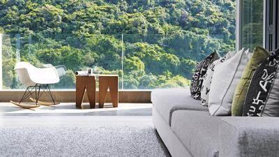
It’s not often that the design of an entire home revolves around chairs. In this Hong Kong home, however, the owners’ mismatched wooden dining chairs became the focal point for the whole apartment, as did their Hans Wegner armchairs, which are a particular source of pride and joy. “Who doesn’t love Hans Wegner?” asks the man of the house, who also has a series of posters relating to the legendary late Danish designer.
“My husband likes chairs, but he’s not a designer; he’s an investment banker,” his wife laughs. “Maybe when he was really young he aspired to be a designer, but his parents didn’t let him, who knows?”
Had time allowed, the couple would have travelled to Denmark to find the perfect pieces for their new abode in Hong Kong.
As it was, they were time-constrained, so they ended up sourcing furniture in the husband’s hometown of Melbourne, Australia. In the process, they acquired a number of unusual vintage pieces, including an antique saxophone that has been reappropriated as a funky lamp stand. Behind the couch, framed art-deco posters, art-exhibition flyers and original prints have been framed and carefully arranged on the back wall to create an eye-catching feature. Many of these pieces had already been chosen before A Square, the Hong Kong-based interior-design company that was called in to help decorate the flat, started on the initial design sketches.
The 1,500-square-foot property is located in the Mid-Levels, a prestigious residential area in the island’s Central and Western District that is particularly popular with expats – largely because it’s close to the city but also offers greater proximity to nature and, reportedly, better air quality than many other parts of Hong Kong.
Keeping the homeowners’ unique collection of furniture and artefacts in mind, A Square’s chief designer Tony Wong made sure that the rest of the decor was relatively pared down. “We created a very minimalist canvas, so that their outstanding and trendy pieces could easily be adopted into the space,” he explains.
With the focus steered away from decorative touches, the designer concentrated his skills on maximising the space in the home.
Both parties originally toyed with the idea of an open kitchen, but ultimately decided against it in favour of a larger space that was more conducive to cooking big family meals. The homeowners also wanted a brick wall, but introducing this feature risked making the dining room too dim. To resolve this, Wong constructed a thin glass strip at the top of the wall that separates the kitchen and the dining room, allowing natural light to filter through the kitchen’s large windows and into the dining area. The design also capitalises on the views afforded by a Mid-Levels address, with sliding glass doors allowing the living room to seemingly extend out onto the balcony, which is a sun-filled spot that overlooks lush, verdant hills.
Little remains of the apartment’s original layout. The previous owners – a couple – had designed the space with two adults in mind, whereas the new owners wanted an interactive family home. So Wong and his team decided to start from scratch. To create the illusion of higher ceilings, they shortened the height of custom-made furnishings – such as the large, L-shaped sofa in the living room – by a fraction. These playful optical tricks continue through to the master bedroom, where built-in wall-to-wall closets finish a couple of inches below the ceiling. This changes the perspective from the bed: the couple can look up at a backlit wall, rather than staring at a row of cabinets.
As in many homes on Hong Kong island, space was of the essence; especially since the family of three has another child on the way. “We want our children to have the space to play, so we didn’t want to cram in too much stuff,” says the lady of the house.
They decided against having a coffee table and too much furniture. Instead, they opted for a moreflexible, open area. This ensures that there’s plenty of room for guests to lounge, and it also allows their 2-year-old son to flop down on the soft, heather-grey shag-pile rug during family movie nights.
These homeowners may have kept their furnishings on the minimal side, but what they have chosen has been picked with care, thoughtfulness and a keen eye for timeless design. It’s a home brimming with interesting, highly personal features – from quotes by Gandhi on the wall and decorative wire bird cages in the living room to colourful wall decals in the children’s room and a study area tucked into a nook between the master bedroom and its en suite bathroom.
In this lovely home, it’s all about quality, not quantity.
weekend@thenational.ae

