How many colours are there in a field of grass to the crawling baby unaware of ‘green?’,” asked the avant-garde filmmaker Stan Brakhage.
A number of recent studies and articles have shown that the human ability to perceive colour is not straightforward. Knowing the name for a shade predisposes the eye to seeing it, and colour groupings, such as seeing orange as closer to red than yellow, are culturally determined.
But it’s also the case that the colours that make their way to us – what shade of red or blue or green that we see, for example – hold scientific, cultural and political stories all of their own, too.
How colour is made
The dark, light-consuming colour of the oval abstractions in Jene Highstein’s enormous works on paper, currently up at the Jean-Paul Najar Foundation in Dubai, is “bone black” – a pigment made from incinerating the bones of animals, and also those of humans, once upon a time. For Highstein, it was a way of connecting to an art-historical lineage: bone black appears in Egyptian, Greek and Roman art, as well as in works by the Old Masters.
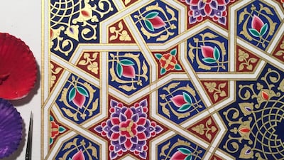
Islamic calligraphers likewise choose paints with an eye to their sources, notes Dana Awartani, an artist from Jeddah who studied pigments as part of a course in traditional Islamic illumination. “Arabic calligraphers would use lamp black,” she says. “They gathered the soot from the lamps in mosques and would use that to paint with.”
Awartani is one of a number of creatives and designers who are investigating colour as a way to celebrate local cultures. She draws out the deeper meaning of colour within Islamic and Eastern mysticism for her illuminations, sculptures and installations.
“Symbolically, if you look at traditional manuscript painting or miniature painting, the predominant colours are blue, gold and red,” she explains. “If you look at old versions of the Quran, the outer border is in blue, which symbolises that God’s mercy is above all else. The blue also relates to the idea of an oasis – it is a luxury in a religion that comes from a desert where water is so scarce.”
For Awartani, colour is not just a visual effect, but an important process within her practise. It is part of making the artwork, as well as a way to counter the fast pace of industrial society.
“We’re in a capitalist society and everything needs to be made quickly and to satisfy the market – and I don’t like that at all,” she says. “Preparing your paints is really time-consuming. It’s a dying art form. No one cares about it; no one knows about it.”
It takes, for example, half a day to transform gold leaf into pigment. Awartani grinds the gold leaf, mixed with gum Arabic (made from the hardened sap of the acacia tree) and a few drops of water, on a stone plate for about an hour. Then she lets the mixture soak in water for a few hours so that the gold will drop to the bottom, eventually pouring it through a silk cloth to remove any dust.
The slow process isn’t simply chosen out of fidelity to technique. It helps her get into the state necessary to apply the paint to the geometric pattern, in areas that can often be only the size of a ladybug.
“With a lot of traditional craft, it’s about rigour and discipline,” says Awartani. “It’s meditative. My geometry professor would tell me you could never do geometry when you’re unstable or anxious or angry or not centred – you’d mess it all up.”
It also underlines a value in nature that synthetic paints bypass. Even to apply them, she uses a paintbrush made from the hairs of a squirrel’s tail, and, as is traditional, holds her paint in shells, whose slope allows her to soak just the right amount of paint on the brush without damaging its fine fibres.
“It makes me appreciate the environment a lot more,” she says.
“Different environments, metals, plants, create different colours. It gives my work a link with nature and the universe.”
Where does colour come from?
Natural dyes tell stories about their environment: the prevalence of reds and yellows in traditional Emirati handicrafts comes from the fact that henna and turmeric, which are used to produce these colours, grow naturally here.
When Khalid Shafar, a Dubai designer, began thinking of ways to integrate Emirati crafts into his furniture designs, he chose naturally-dyed mats of woven palm leaves, the red and yellow rush mats of which now top his wooden tables.
Similarly, Afghan carpets, which historically come from the north of Afghanistan, were made in dark reds and blues: the reds come from walnut shells and pomegranate skin, and the blue from indigo. The Fatima bint Mohammed Initiative (FBMI), based in Dubai, revives traditional methods of carpet production in order to provide employment opportunities for Afghan women. They too have returned to the original natural dyes that were once used – which also last longer than synthetic ones.
“Over centuries, we in Afghanistan have always used natural dyes – pomegranate, saffron, any type of tree, even crushed semi-precious stones, like lapis lazuli,” says Maywand Jabarkhyl, managing director of the initiative.
FBMI still uses pomegranates and other materials harvested locally, but, admits Jabarkhyl, they don’t know how the dyes are actually made. The wool is dyed at FBMI’s main site in Kabul, overseen by one man, a Turkmen Afghan in his mid-forties, from the northern area.
“It’s a family secret that he doesn’t pass to us. The area where the dyes are made is locked up, and he won’t tell anyone because he doesn’t want to lose his business,” says Jabarkhyl.

The introduction of new colours, such as pinks and greens, into handmade carpets reflects a response to consumer demand – as well as increased trade in the area. Indeed, the history of colour can be seen as the history of trade.
Colours appear through trade
Like the use of blue in Quranic illumination, in Christian devotional painting, blue represented the heavens – but only from the late 1200s onwards. Before that, blue in western painting was scarce and muted. Why is this so? Because blue is the hardest pigment to manufacture, and western painters were not able to produce a long-lasting pigment until lapis lazuli made its way from the mountains of Afghanistan to the trading port of Venice.
The Venetian painters called the new, bright blue colour “ultramarine”, or “over the sea”, named after its trading route – and used it to depict the heavens. By the early 1300s, its price had risen – some say because of supply restriction by the church – and at one point it was more expensive than gold. This blue became used only for the cloak of the Virgin Mary, in a custom that lasted two centuries.
Similarly, blue didn’t reach Australia until more recently, and its story there coincides with that of colonisation. “We have pigments that move into blues – duck egg blue, smoky blue – but nothing like a bright blue,” says artist Dale Harding, who is of Aboriginal descent. Harding’s work tells the fascinating story of the colour “Reckitt’s Blue”, a laundry powder that became a paint pigment for Australian Aboriginals.

On the way, he reveals the history of indentured domestic labour that the indigenous people of Australia were subjected to, including his mother, his grandmother, and his great-grandmother.
“When the colonial frontier moved from Sydney to Brisbane and then to where my family lived, in Queensland, Reckitt’s Blue was a trade item,” Harding explains. “Here comes this powdered blue pigment and we knew exactly what to do with it.”
Indigenous people used it for rock-painting alongside the oranges, reds and yellows that existed naturally. But, says Harding, “from the 19th century, when legislation required the forced removal of Aboriginal people to [reserve parcels of land] to live their life under government control, the blue changed completely and became a stain on the hands of the Aboriginal people.”
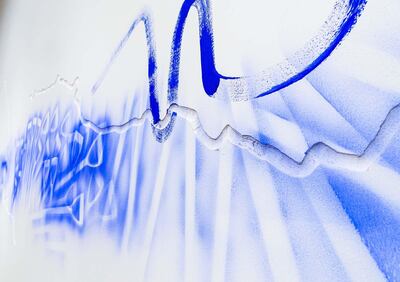
As a popular washing powder at the time, Aboriginal people used Reckitt’s Blue “to wash the laundry of the coloniser”, Harding says. Alongside friends and relatives – similar to how Aboriginal rock paintings were always made – Harding now uses the material to create a new narrative around the colour. He makes his own rock paintings, the traditional way: he puts the blue powder in his mouth, and blows it out onto the wall, now the white plasterboard of the art gallery rather than the sandstone of old.
With this technique he forms bursts of colour, outlining the tools and items of material culture that Aboriginal people used in their wall paintings.
Traditionally, they created outlines of spears and boomerangs, but Harding has used, for example, shovels.
He laughs. “It’s just what I had around me,” he says of his choice of implement, which became part of a wall painting in 2017 at the Queensland Art Gallery – the museum that now stands in the lands of his ancestral people.
What colours do we see?
How can you be sure the “blue” you see is the same as the one I see? The subjective nature of colour has fascinated philosophers, scientists, psychologists – and, of course, the internet-reading public.
A number of recent studies have shown that knowing words for colours means you are more likely to see them. Because in the industrialised world we might need to differentiate between beige and khaki, we’ve developed words for exactly those shades. Or, after Apple introduced products in “rose gold”, we started seeing that hue as distinct, whereas before, we might just have seen it as “pink”.
_____________________
Read more:
How Nargess Hashemi imagined a new urban utopia, one colour shade at a time
This is the world’s favourite colour. Find out why
_____________________
It follows that the opposite should also be true: if you lack a word for a colour, you lack the colour entirely. The widely circulated "Himba experiment" seems to back this up. Researchers apparently showed 11 squares of blue and one square of green to an isolated tribe in northern Namibia who lacked the word for green. The results claim that the Himba could not see the green, which, to modern eyes, is practically holding a neon sign advertising its affinities with Kermit the Frog. The story was circulated on the BBC and elsewhere, but doubt has been cast on its veracity, as no write-up of the original experiment could be found.
__________________
Read more: Are you colour-blind?
__________________
It is safer to say that there are certain cultural predispositions as to how we classify and organise colours.
Take aqua: for most in the West, that’s a greenish blue. But for the Jahai people on the Malay Peninsula, it’s a blue-green. And while we most likely see the same blues as each other, what we name as blue isn’t always consistent – mostly because the natural world is also inconsistent. The fact that blue is always such a latecomer to art and literature is surprising to many – how could we lack blue with the sky perpetually above our heads? But, as a great podcast on colour at Radiolab shows, we have to be trained to call the sky blue. Less so in the Gulf, but if you look up in the UK or the Netherlands, you’re just as likely to see white and grey.
And, as artists are now exploring, what colours were available for us to see were long limited by the natural environment. The industrial and digital revolutions have vastly widened the colours we can summon at a moment’s notice. It may seem strange now to think of being colour-poor, but we should think about colours themselves – not just the canvas or fabric they live on – as a treasured resource.


