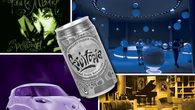
Human taste is an amalgam. We take a little from everything we like to form distinct and personal choices for everything, from the clothes we wear to the furniture in our living spaces.
After a while, patterns begin to form, and what we describe as a taste is probably part of a particular aesthetic. And design aesthetics are evolving every day, creating new styles that influence everything from fashion to electronics.
As millennials and Gen Xers grow older and start to yearn with nostalgia for their childhoods, forgotten past aesthetics are now making a return.
Through posts on TikTok and Instagram, users are zeroing in on the particular styles they enjoy, discovering that there are more people who share their feelings, too. These aesthetics are often associated with specific design movements that aren’t popular any more, but still hold a special place for some.
For World Design Day, here are some forgotten design aesthetics making a comeback on social media.
Frasurbane

This aesthetic is a portmanteau of Frasier (the popular Cheers spin-off sitcom) and Urbane. Popular in the 1980s and '90s, the style could be described as both conservative and wealthy.
The design style is used to indicate a level of class and sophistication, much in the way Frasier Crane styled himself and his apartment on the TV show. There are flares of classical music, smooth jazz, serif fonts and muted beiges and greens.
Frasurbane would have been called 1990s Urbane during the height of its popularity. Its tenets were a direct response to the wacky Memphis Milano styles of the 1980s as the baby boomer generation found wealth and prosperity, choosing to style their spaces in a way that screamed expensive.
Much of the Frasurbane aesthetic can be traced back to Renaissance era art and scientific illustrations. Picture Leonardo da Vinci’s Vitruvian Man surrounded by minimalist blocks and subtitled with an elegant font, and the identity of the aesthetic becomes clear.
Frutiger Aero

Sometimes called Web 2.0 Gloss, Frutiger Aero is the design most associated with tech companies in the early 2000s. It usually incorporates images of water, greenery, animals and the latest in tech hardware.
The biggest proponents of Frutiger Aero are Microsoft and Apple through the design choices made to market their newest innovations during the period. This style is still fresh in most people’s minds but is recently finding renewed interest for nostalgic reasons.
The name of the aesthetic comes from Adrian Frutiger, a Swiss typeface designer whose work was used to illustrate the identity of the style.
Frutiger Aero is simultaneously static and alive, presenting images of nature clashing with technology in a way that sparks the imagination. Tech companies have used the design to convey the sense that their machines are not cold and stale but vibrant and energetic.
Whimsigoth

If the adults in the 1990s were surrounding themselves with Frasurebane, the teenagers were all about Whimsigoth. The design style is a mash-up of witches, gothic elements and dark colours. It is mysterious and intriguing, evoking imagery of vampires and witches, with its association to potential danger.
Back then, the style could be found in all manner of media, with television shows such as Buffy the Vampire Slayer and Charmed helping to make the aesthetic all the more popular. Music also had a role with acts like The Cure, Cocteau Twins and Kate Bush contributing to its renown.
Whimsigoth is a maximalist style, with its fans fully engaging through jewellery, wall art, clothing and more. The style had wound down by the early 2000s, with it evolving and changing into the goth and emo aesthetics.
The style in its truest form is not gone completely, as artists such as Florence and The Machine and filmmaker Tim Burton remain enforcers.
Global Village Coffeehouse

Despite being popular in the 1990s, the aesthetic known as Global Village Coffeehouse had its most famous use in the 2000s after Starbucks adopted its style in its coffee shops around the world.
The tenets of the style are combining the wacky stylings of Memphis Milano with muted earthy colours and exaggerated corporeal shapes. As the name indicates, it has been mostly found in coffee shops and restaurants.
The look is very warm and welcoming, making it suitable for retail shops as well. Despite being manufactured, Global Village Coffeehouse conveys a sense of authenticity with details of brushstrokes and an airbrushed look.
The aesthetic invites a joyful state synonymous with the optimism of the 1990s. During a time period that felt as though the world was becoming a melting pot of cultures, Global Village Coffeehouse instilled a sense that we were all part of the same tribe.


